Sketch Website Rebrand

2025 · Rebrand · Sketch

Evolving Sketch's marketing site with stronger hierarchy, refined typography, and a more mature visual language.

Marketing homepage redesign hero montage

Context

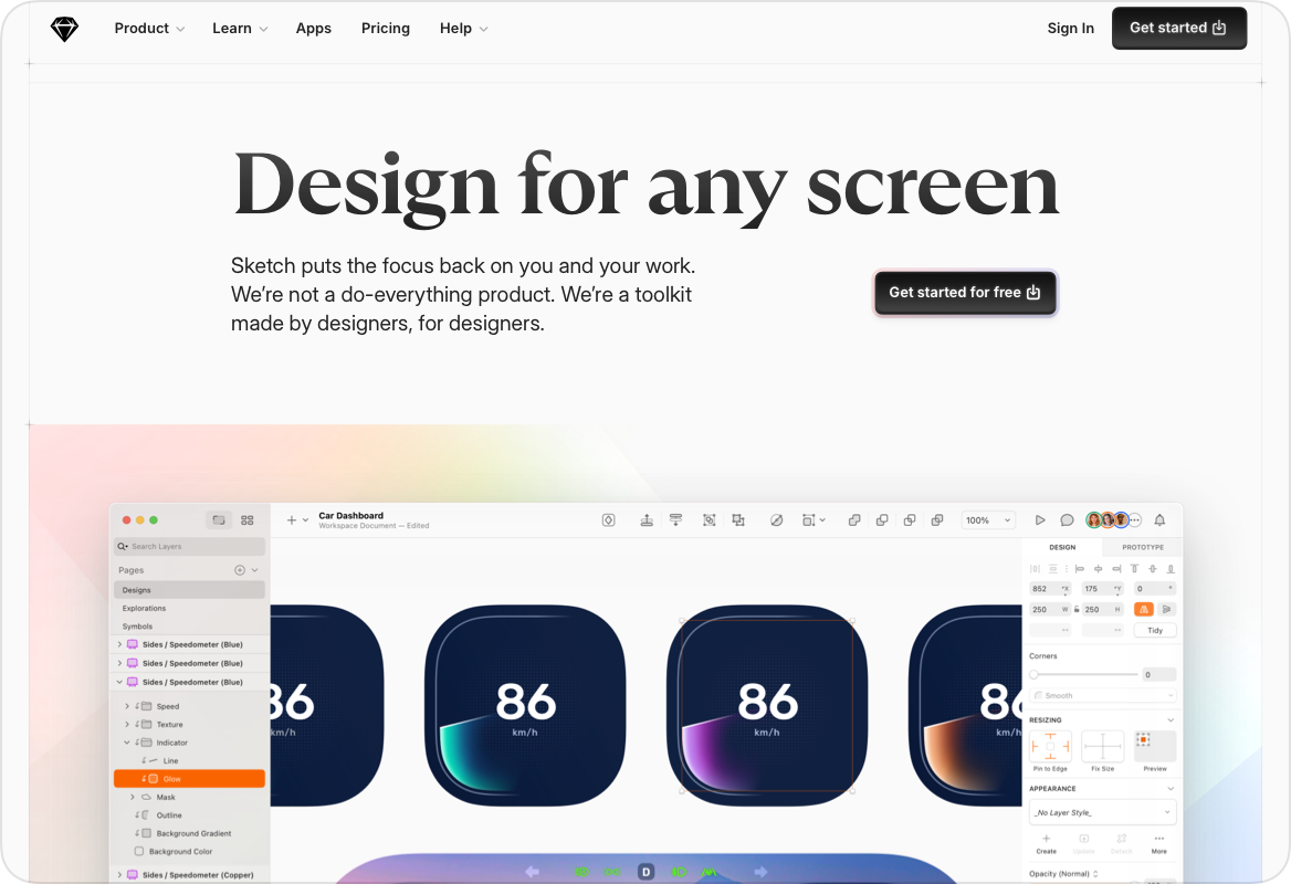
At the time, Sketch had matured as a product, expanding its capabilities and professional audience. However, the marketing site still leaned heavily on expressive stickers and decorative graphics. While energetic and recognisable, the visual tone no longer fully reflected the sophistication of the product.

Context visual showing previous homepage composition
Context visual detail with sticker style elements
Side-by-side concept snapshot, left layout
Side-by-side concept snapshot, right layout

The Opportunity

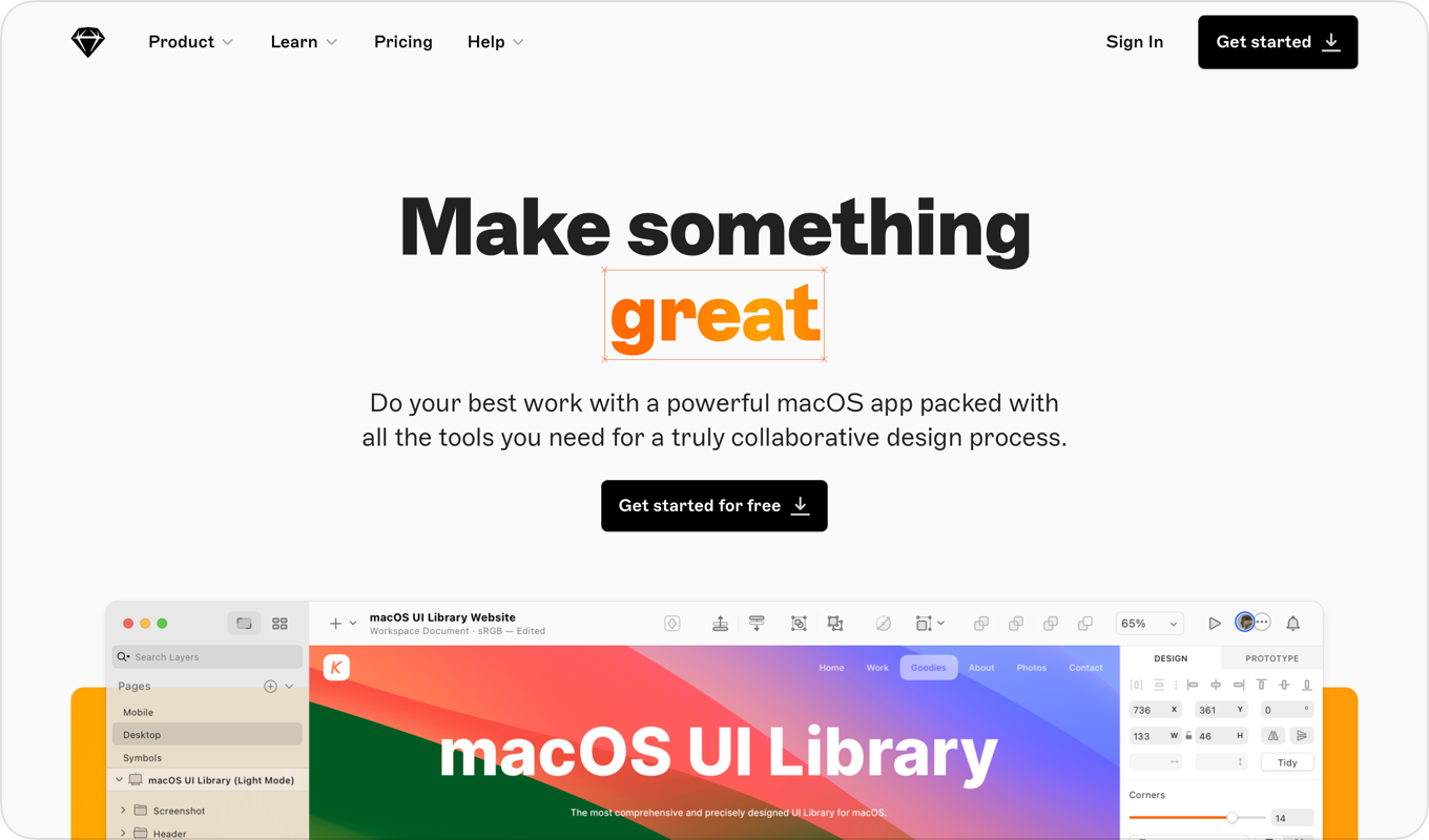
The goal was not to remove personality, but to evolve it into a more refined and scalable visual language.

  • Increase perceived maturity
  • Strengthen typographic hierarchy
  • Reduce decorative noise
  • Reinterpret brand elements more subtly
Opportunity visual showing adjusted visual direction
Opportunity visual showing refined brand card

Design Principles

Mature, not muted

Increase restraint while preserving character and quirkiness.

Typographic authority

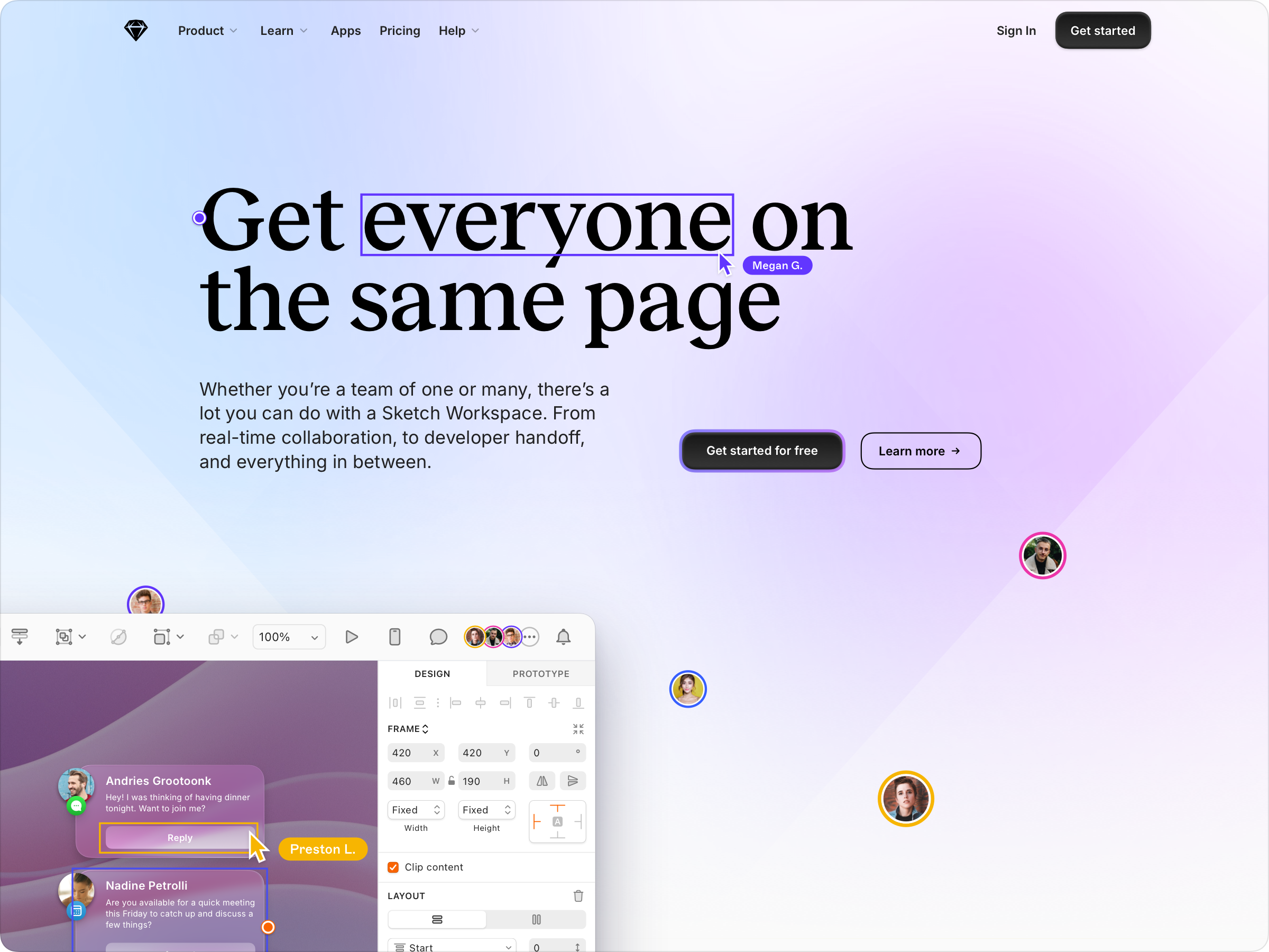
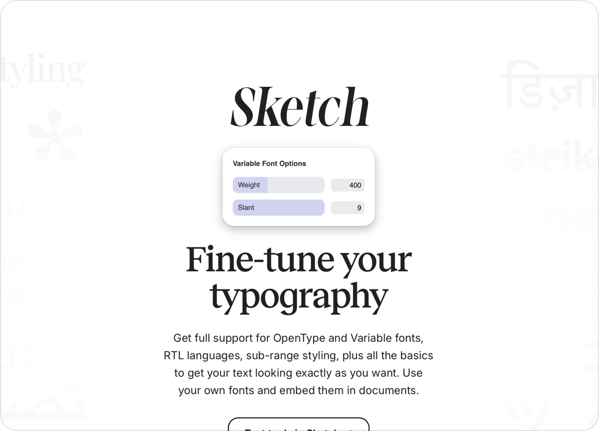
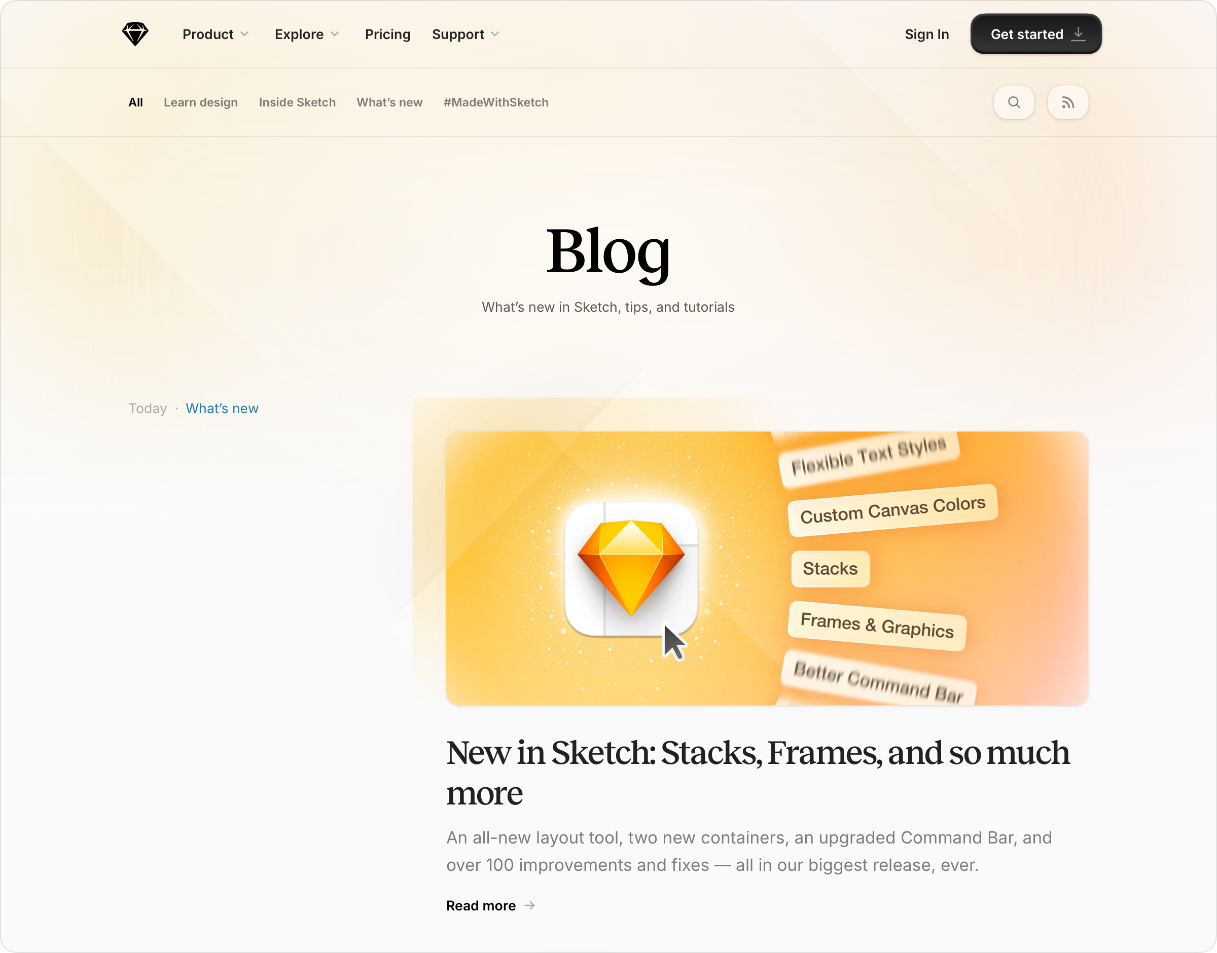
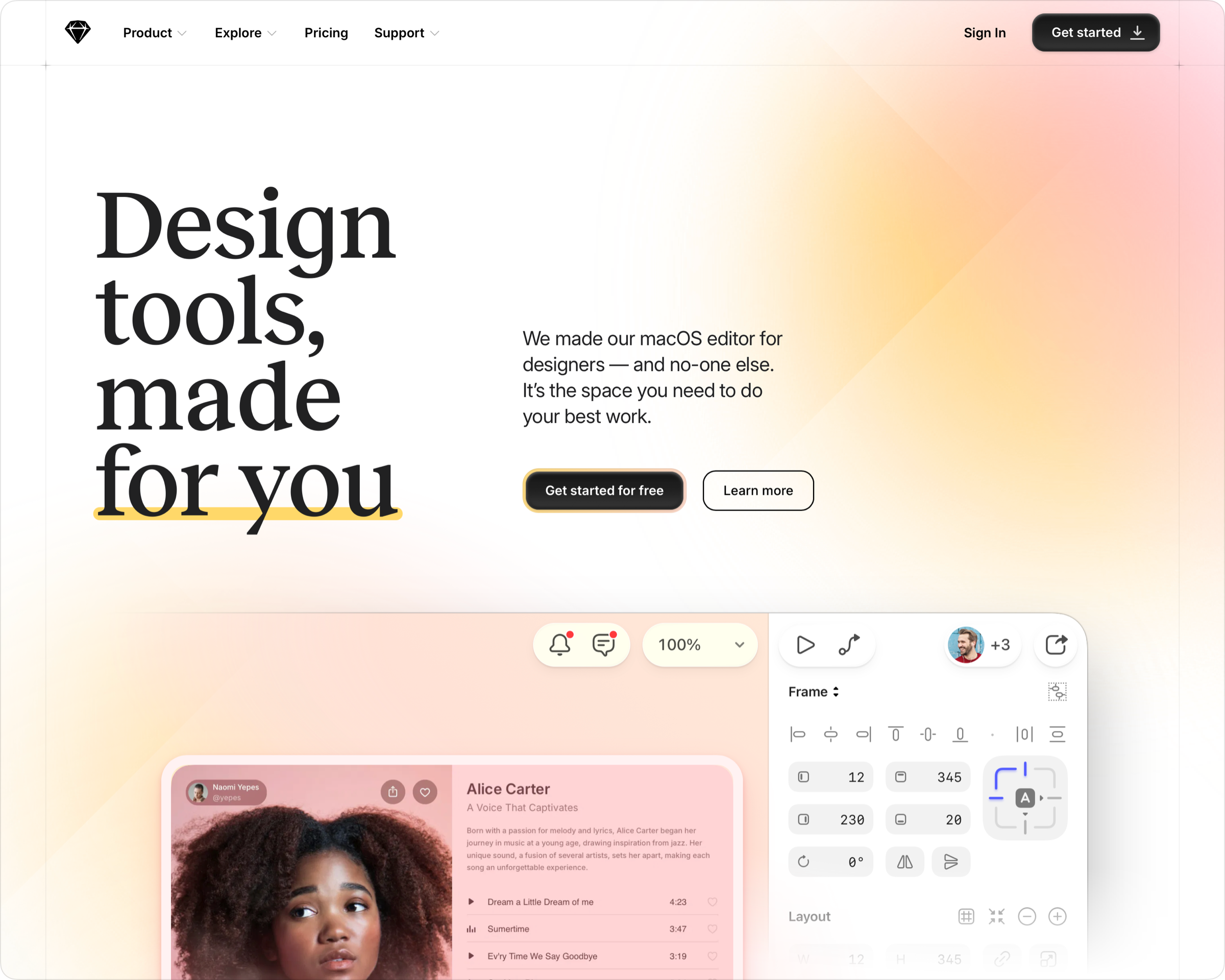
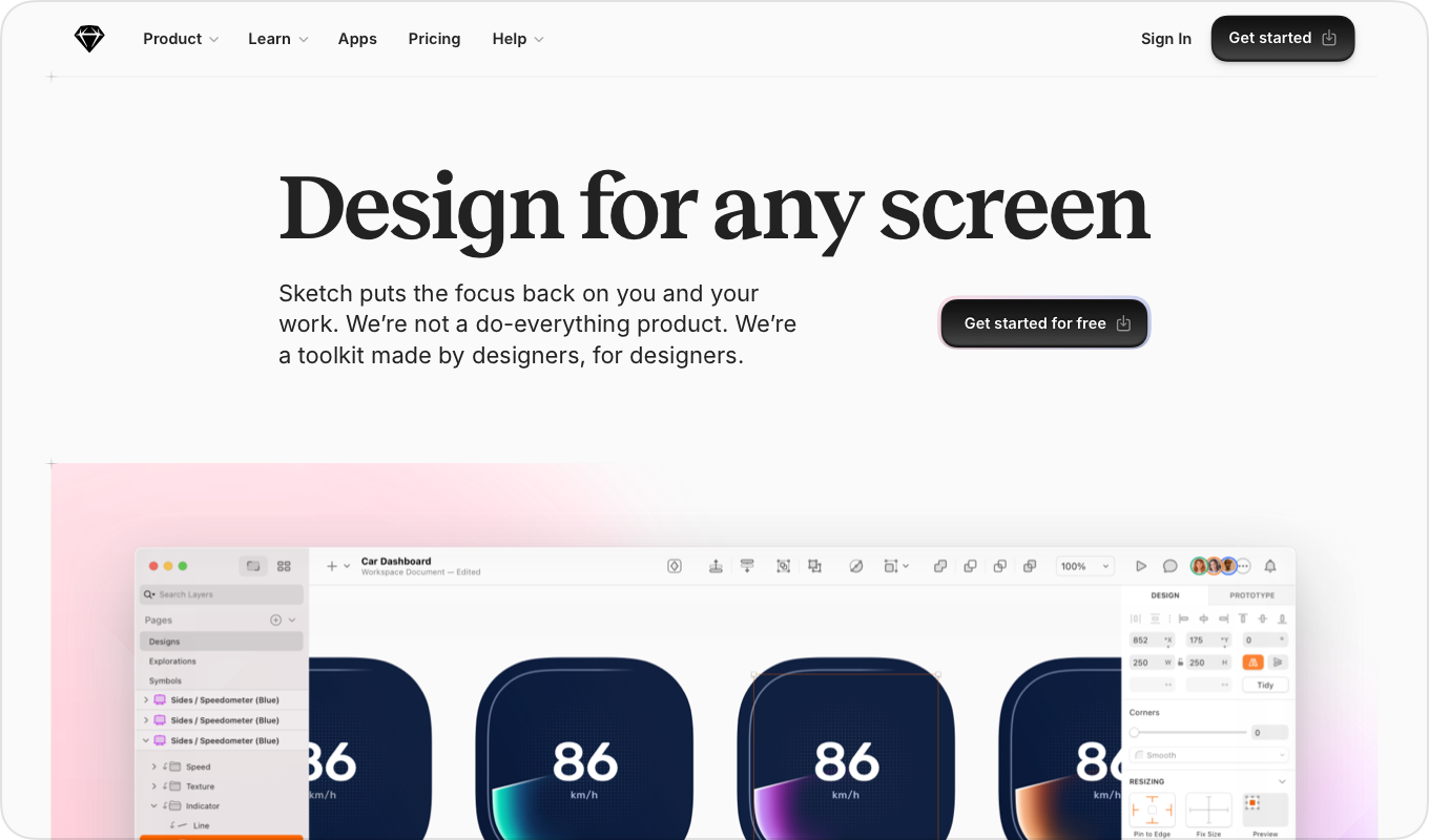
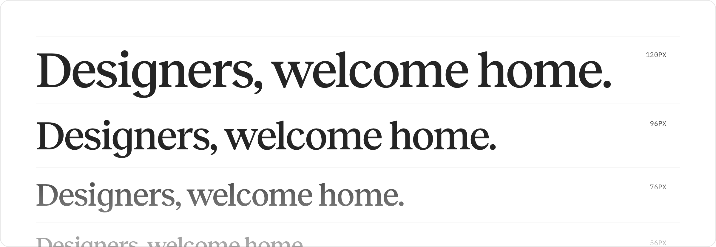
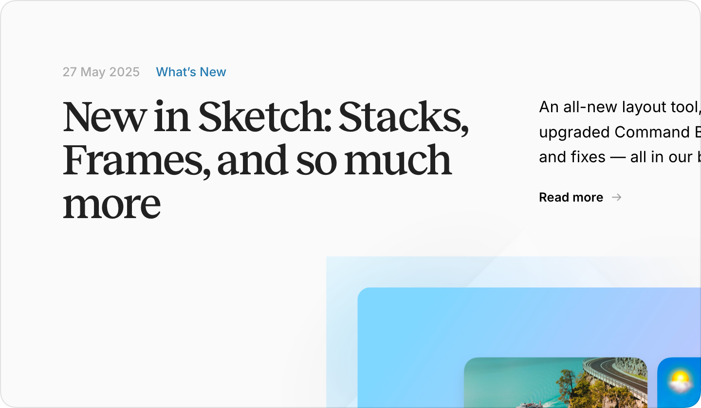
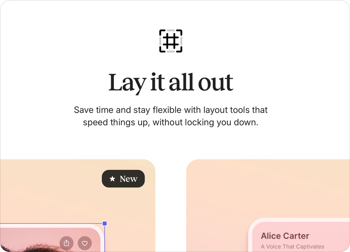
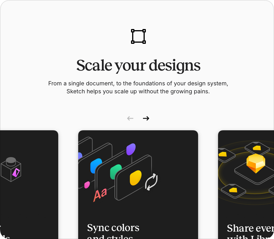
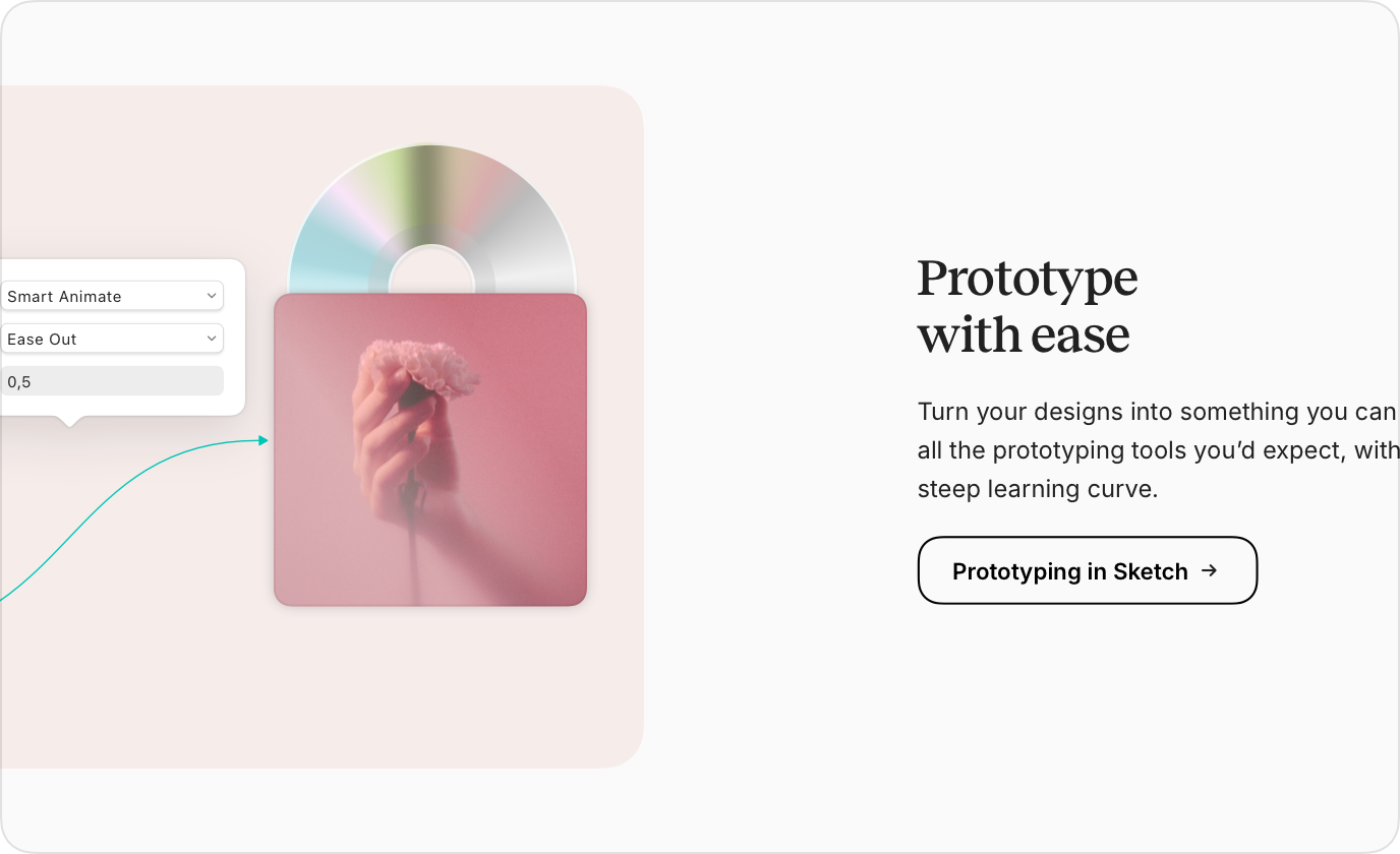
Introduce contrast and hierarchy through a serif and sans-serif pairing.

Subtle brand references

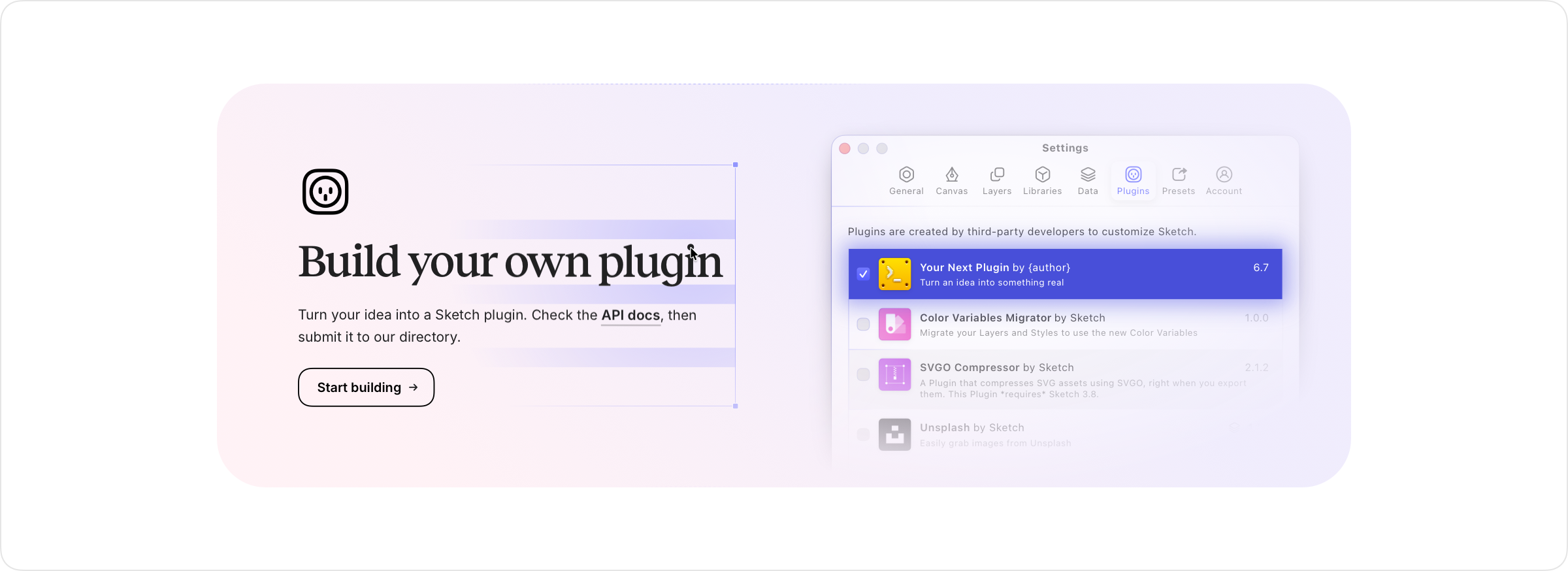
Abstract the diamond motif instead of removing it.

System-ready foundation

Create a consistent foundation for future campaign and marketing work.

Exploring Direction

I explored several tonal directions before narrowing in on a balanced evolution of the brand.

Design principle board with directional options
Direction exploration card, concept one
Direction exploration card, concept two

Elevating Typography

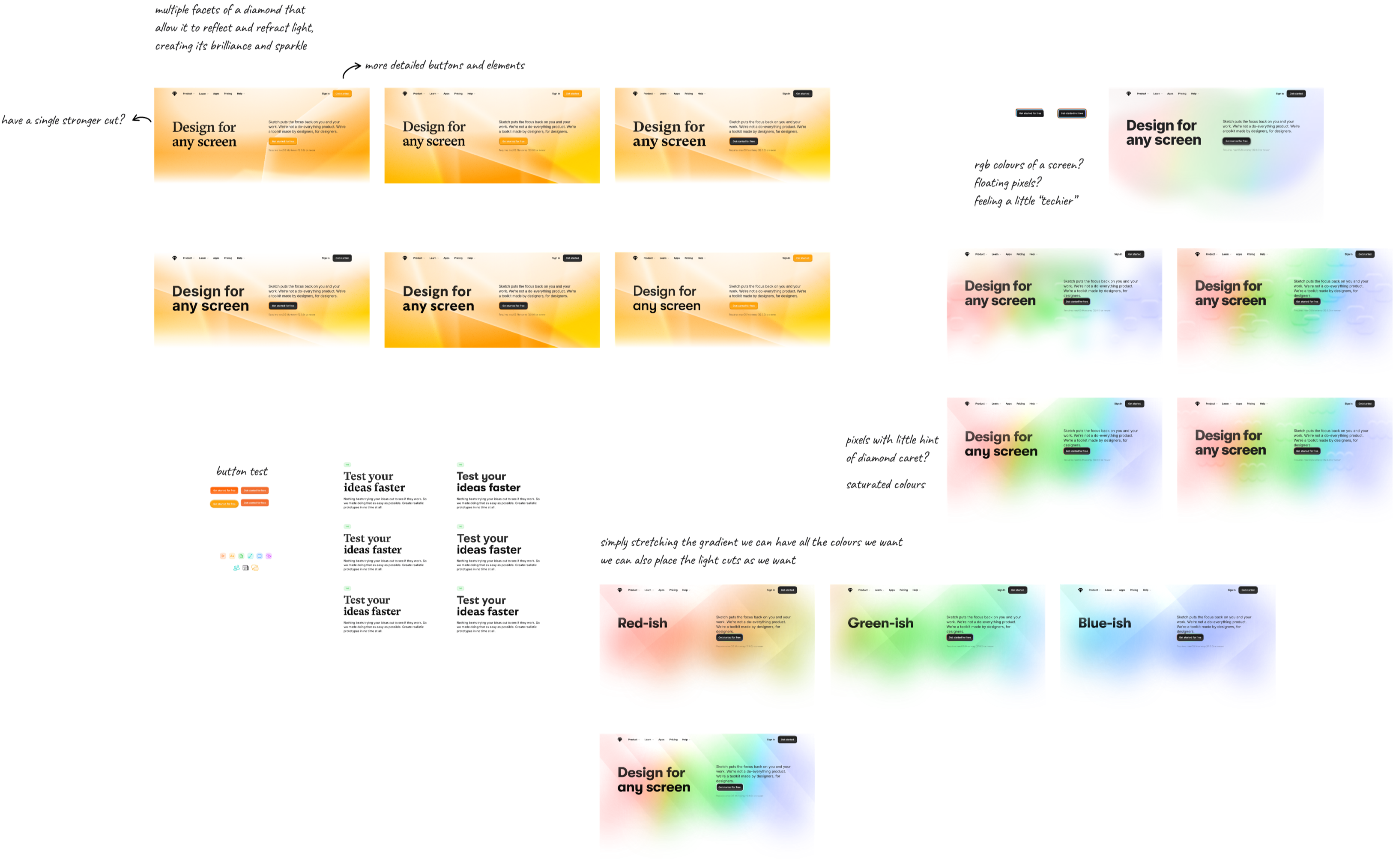
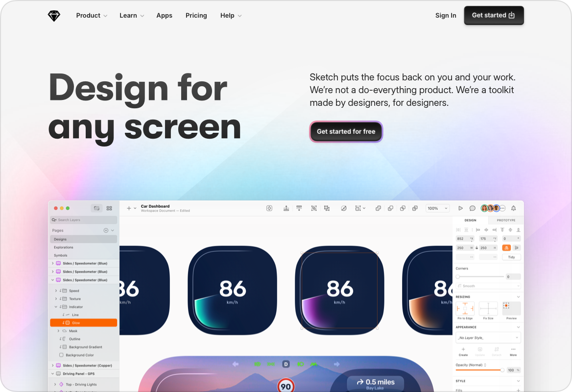
The previous typographic system relied solely on Marfa, which provided consistency but limited tonal range. The new system introduced a serif for editorial authority, paired with Inter for clarity and continuity with the product UI.

Typography specimen and hierarchy comparison
Typography application card, left
Typography application card, right

Visual Language Refinement

Expressive elements were reinterpreted instead of removed.

  • Reduced decorative stickers
  • Abstracted the diamond motif into softer accents
  • Toned down colors with subtle blur layers
  • Increased whitespace and rhythm
Visual language sample card 1
Visual language sample card 2
Visual language sample card 3
Visual language sample card 4
Visual language sample card 5
Visual language sample card 6
Visual language sample card 7
Visual language sample card 8

Outcome

The refined direction introduced stronger hierarchy, improved clarity, and better aligned the brand tone with the product's maturity. It also created a stronger foundation for future campaign and marketing work.

Outcome card set, left
Outcome card set, right
Large outcome composition featuring collaboration message
Outcome component sample, left
Outcome component sample, right
Extended UI examples and cards
System usage sample, left
System usage sample, right
Typography specimen panel for IBM Plex Mono
Additional sample card, left
Additional sample card, right
Extensions panel and component matrix
Supporting visual strip with product cards
Blog and editorial layout exploration
Closing card, left
Closing card, right